
The invitation I designed for our Lookout Google I/O kickoff party is making its way off to people’s inboxes around the Tech space in SF.
Little android man made up of Lookout icons designed by Nam Bui, Product Designer at Lookout.
Our design has already been reposted on several Android blogs, including this one.

Two major releases in the App world that are worth highlighting.
One Twitter just released their brand new app, #Music (available in the App Store, which streamlines the already prevalent links between apps like Spotify & Rdio (both of which have recently redesigned websites worth browsing) with Twitter. I don’t know about you, but I widely use Twitter to interact with musicians/producers/artists, and I also actively listen to their music on Spotify. This is a clean link and some beautiful and innovative interaction design and experience. It’s free, so it’s worth playing around in! See how things move even if you don’t use Twitter or Spotify.
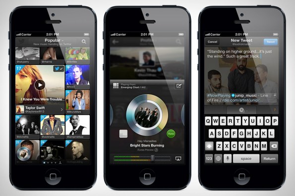
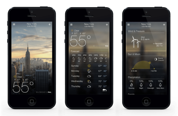
Two Yahoo! just redesigned/introduced a gorgeous application for weather. Download it in the App Store. I only wish they had followed through in all aspects of the design. They have beautiful interaction and beautiful typography and photography, but they are significantly lacking in elements such as the app icon itself, the startup/landing page, and the menu in swipe-left that lists settings etc. I do appreciate the scroll-triggered animations and the parallax scroll blurring etc.
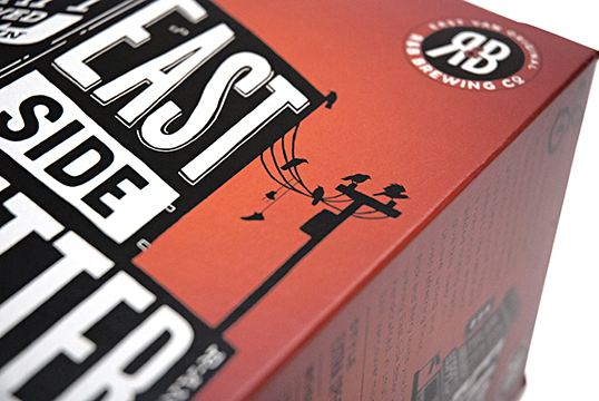
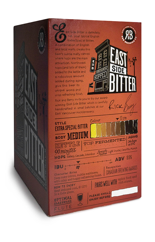
Per the slight tradition I’ve developed, it’s beer-design-Friday. Enjoy this lovely brew East Side Bitter designed by Saint Bernadine Mission Communications Inc.. I love the character in this one. the use of perspective in the typography on the facade of the building is great. As an added bonus, all of they type is hand-drawn, so good luck trying to download those typefaces :) “every element on the packaging is rendered by hand, including the bar code.”
They say:
R&B Brewing is one of Vancouver’s original East Van micro breweries, predating the current trend by almost two decades. Partners Rick (“R”) and Barry (“B”) asked St. Bernadine to help with a packaging redesign, initiated by the move from 650mL bottles to a standard 341mL 6-pack format.


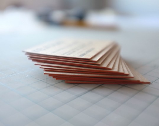
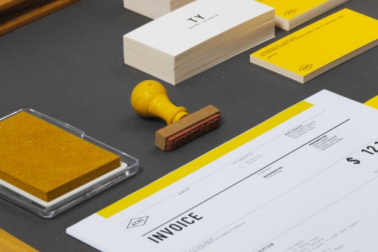
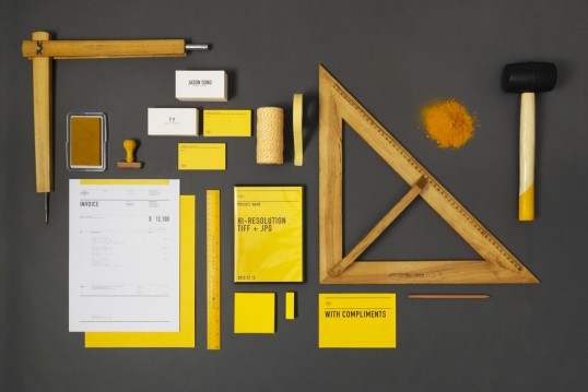
It’s been a while (nearly a year to the day) since I’ve done one of these kinds of posts. Here are just a few beautiful examples from Lovely Stationery, (the same curators as Lovely Package).
———
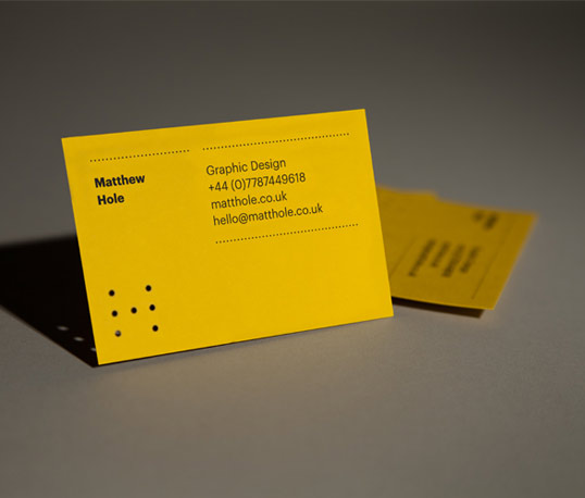
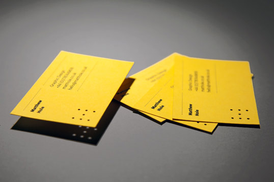
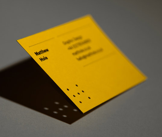
I figured I’d repost my favorite design, Matthew Hole designed by Matthew Hole of the UK. I love that the series of Holes are an H and an M and are holes. Fantastic.
———
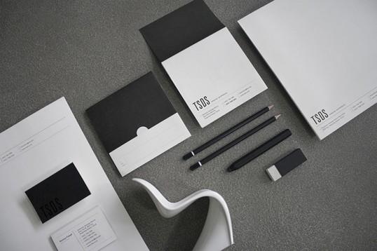
TSDS designed by Noote & Netoo of Indonesia.


———
re-robot studio designed by re-robot studio of Uruguay.


———
Doug Liddle Guitar Instruction designed by St. Bernadine Mission Communication Inc. of Canada.


———
Acre designed by Acre of Singapore.

———
Pronto designed by Darsha Karpenko of Russia.


When I was in high school, I was in a two year documentary film program called Academy of Integrated Humanities and New Media (AIM). This was a program for juniors and seniors where we learned English, History/Social Studies, and Documentary Filmmaking techniques, and then split off into groups of four to create short documentary films based on what we’d learned. Generally, we’d make five short films per year.
Handprints is a short film about Bolinas Elementary School in Northern California. I was seventeen years old when I made this with Julia Black, Arandelly Mendoza, and Oliver Whitcroft. We were responsible for all the research, story development, interviewing, shooting, and editing. We won an Honorable Mention in the 2007 California Student Emmys.


