physical typography
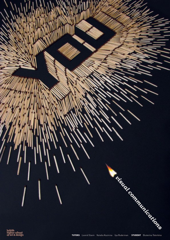
I’m always a fan of making type out of something else. Here are two posters by Katerina Teterkina, of Moscow. Her name sure has a ring. Those lucky designers out there who’s parents gave them awesome names…


I’m always a fan of making type out of something else. Here are two posters by Katerina Teterkina, of Moscow. Her name sure has a ring. Those lucky designers out there who’s parents gave them awesome names…


Genius. Nice one.