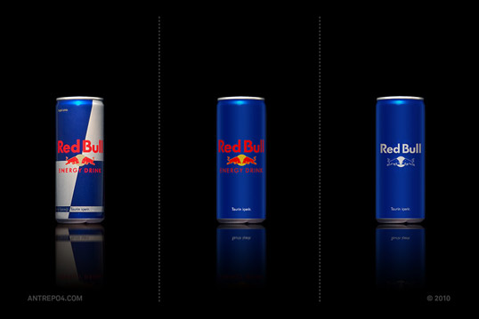
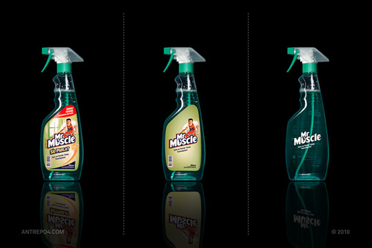
simplification
This is an interesting project, Produced by Antrepo, of Turkey, as an exercise in reduction and minimalism. Here are just a few, but you can see more at Lovely Package.


This is an interesting project, Produced by Antrepo, of Turkey, as an exercise in reduction and minimalism. Here are just a few, but you can see more at Lovely Package.


In general, I prefer the minimalist redesigns because they look just that much ‘classier’. The exception here for me though is Nesquik. Maybe its because of childhood nostalgia that I prefer the old look, but the new one comes off as something by a no-name brand.
I agree, most of them are cool but some of them take it a step too far