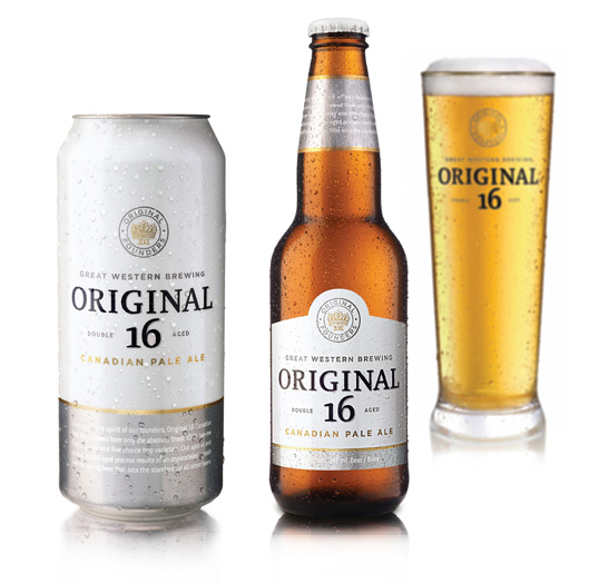
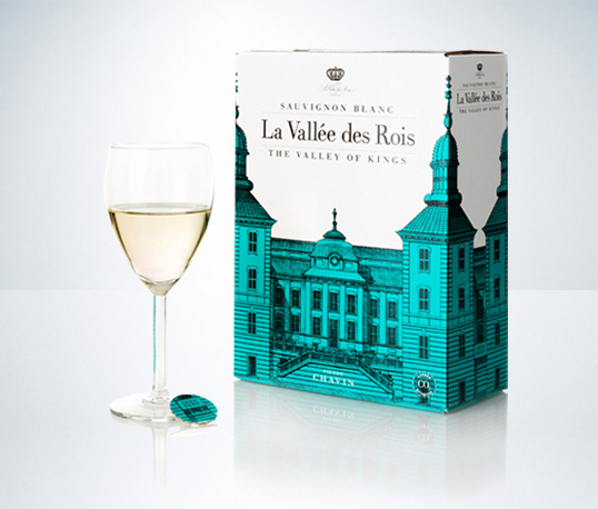
I’ve been looking at cohesive branding systems, or clever identity tweaks or whatever, just interesting stuff. Mostly Design;Defined has really great identity and branding sections, with some overlap. I also like their “friends” section, which is a list of other great websites about design (top left of every page). Here are some of the pieces I pulled as part of my “collect inspiration to show during crit” folder. I’ll post some more soon, but now I actually have to get some work done :)
———
Designed by the Bravo Company, based in Singapore. I really like this project because of the dynamism of their logo, which is, albeit, a bit complicated/detailed, but the application in the unusual business card is very clever. They also designed the Five and Dime project, which has some really nice typography. See more


———
Vincent Ramsay-Lemelin, based in Quebec. See more pictures of l’Usine.

———
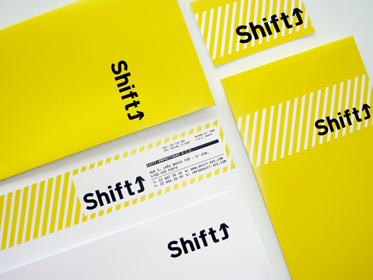
Alexandra Mendes, based in Portugal, neat project Shift. I don’t know why, I just like this one. Maybe it’s the monospace type and the simplicity.

———
Pedro Miguel Lopes, based in my favorite Barcelona, Spain, has some pretty neat work. See more of this nice modular book design here.


———
David Espinosa, based in Bucaramanga, Colombia, project Mago.


I love this poster I really do. I’d like one, but I don’t know if it’s for sale. Go check out Eunice Yip‘s Behance to see a few more pictures of it. Beautiful tone, minimal, nice message.


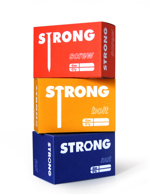
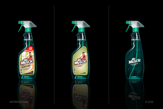
This is an interesting project, Produced by Antrepo, of Turkey, as an exercise in reduction and minimalism. Here are just a few, but you can see more at Lovely Package.
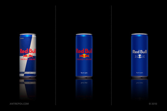


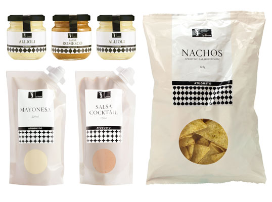
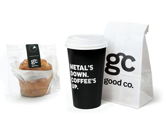
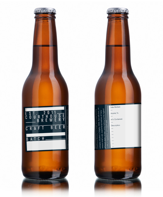
So remember how I told you guys I’ve been looking at tons of branding/identity/packaging lately as inspiration for my degree project? Well I bookmarked my favorites. This one will be the packaging post (or at least part one). Click on each image to follow it to the source and see more pics. I can’t really put more than one picture per project or the page would scroll forever. Hope you like these :) There’s quite a variety of types of packaging, ranging from minimal to detailed, innovative shapes, and overall nice design.


