I want to feature two beautiful projects that I’ve admired for quite a while. When I was abroad last spring in Barcelona, at Elisava, there was an exchange student from the UK in my studio, Dan Quanstrom. Though we’re not really in touch anymore (we’re busy and it’s been a year), he’s a really funny guy, very clever, and produces excellent design. These two projects, Death of Little Red, and Pots and Pans, are really excellent examples of what paper craft should be. I hope someday I make time to create something like these.


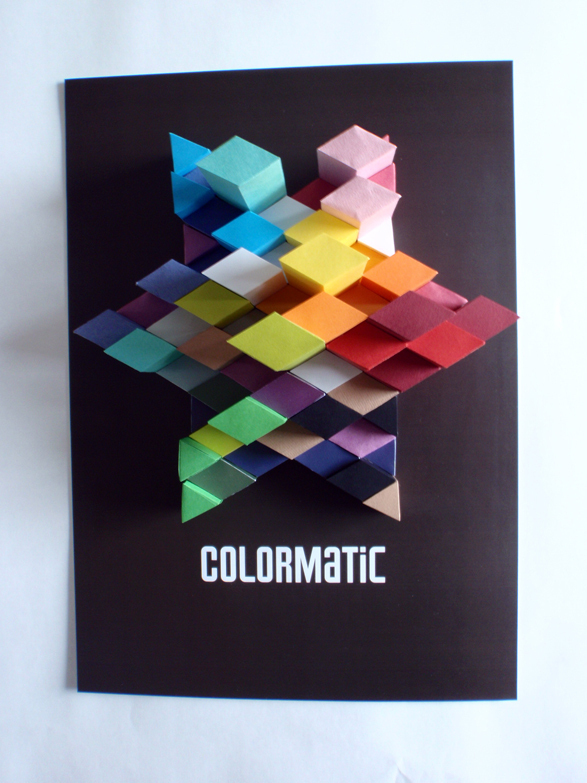
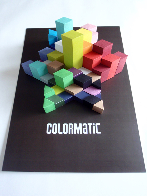
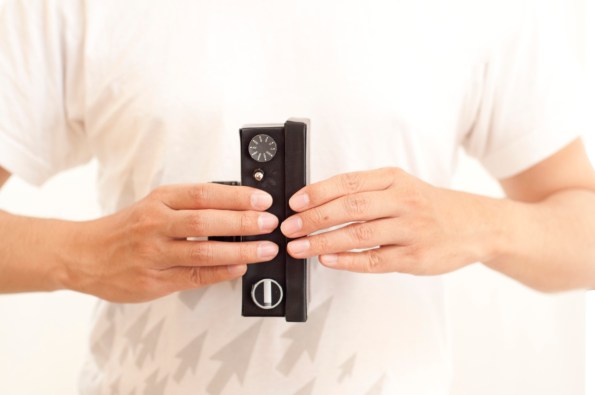
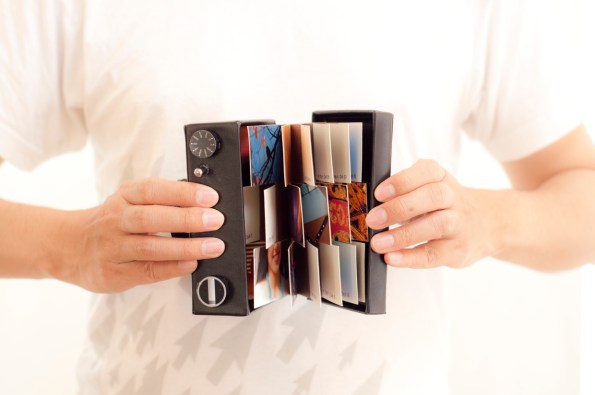
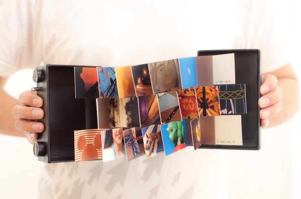
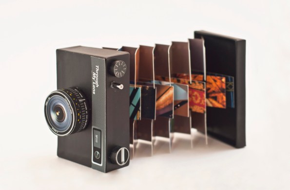
Well this just takes flag book to a whole new level! (mostly it’s the outside that I’m admiring. The content is too subjective for me to identify with, but the camera cover is titillating) Thanyaluck “Tanya” Keawkingkeo calls the project Spicing Up My Memories. She’s from Chiang Mai, Thailand (I’ve been there!) and she’s based in San Francisco (I’m from there! we should meet someday). I found her impressive portfolio on Design;Defined. I’m a big fan of tactility and detail in artist books. I am hoping to remake a few of my own when I have time (ha like that’ll ever happen… at least not till after graduation anyway). Enjoy! (plus the project is well photographed, and that makes a huge difference. Presentation is nearly everything, after you have a good project)


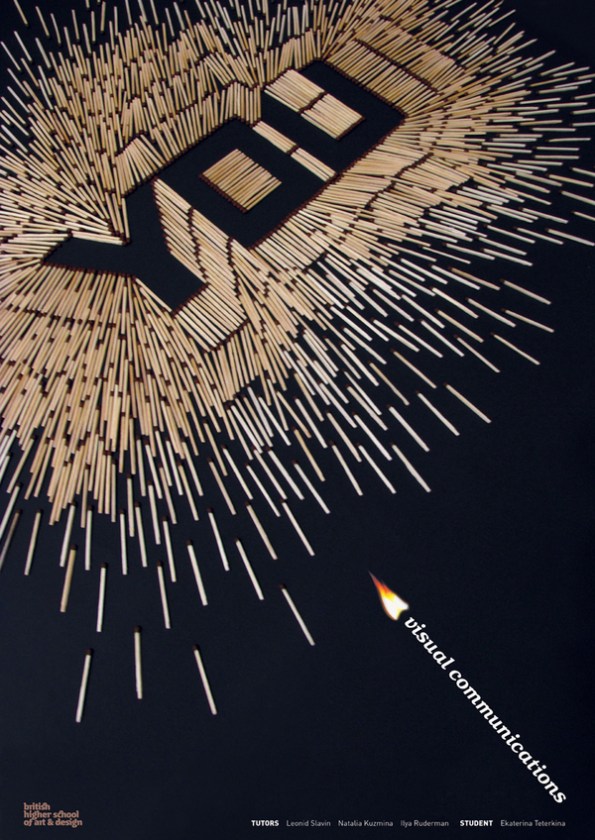
I’m always a fan of making type out of something else. Here are two posters by Katerina Teterkina, of Moscow. Her name sure has a ring. Those lucky designers out there who’s parents gave them awesome names…

Designed in 2007 by Márton Borzák, based in Hungary, a poster commemorating the 50th anniversary of the typeface Helvetica.

Designed as part of a re-branding campaign for converse color customize shoes by Elroy Chong. I love the idea of a three dimensional poster.
