Evelin Kasikov pushes the conceptual boundaries of conventional printing by turning it into a meticulously manual process: embroidery, one of the oldest crafts (dated back to 5th-3rd century BC). Kind of ironic, as printing in CMYK is, in the full spectrum of history, fairly recent (well, subtractive color isn’t recent, just industrial revolution printing techniques are). She says The idea of handmade print started as an academic project. Now, most of my work is based on that. I have created CMYK embroidered illustrations for clients such as The Guardian and WIRED, as well as worked on numerous private commissions.


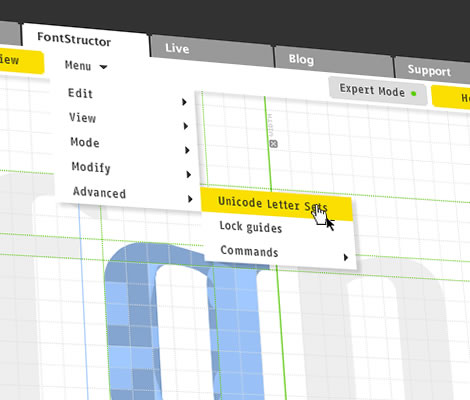
Well, I think the interface takes a bit of getting used to… the lowercase n is my poor attempts at the program :P (I’m better at hand drawing). But it’s actually a pretty cool idea, and they have free downloads. It’d be fun (if I had more time) to try to design a whole typeface. Check out the fontstruct site. They have free downloads too.



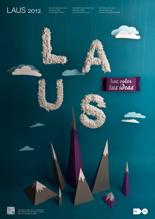
So I’m featuring another project of my friends’, Alex Schmidt and Bogi Mascareñas, students at Elisava. The project they did together, LAUS, is a really beautiful example of well-made, dynamic posters using physical type as image. These guys are both really smart, and really good designers. Check out my favorite projects here and here.
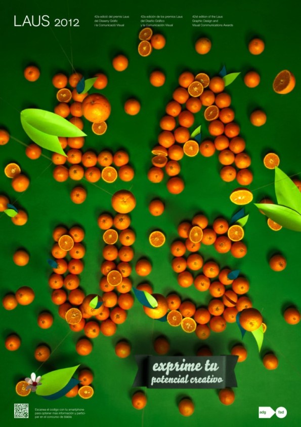
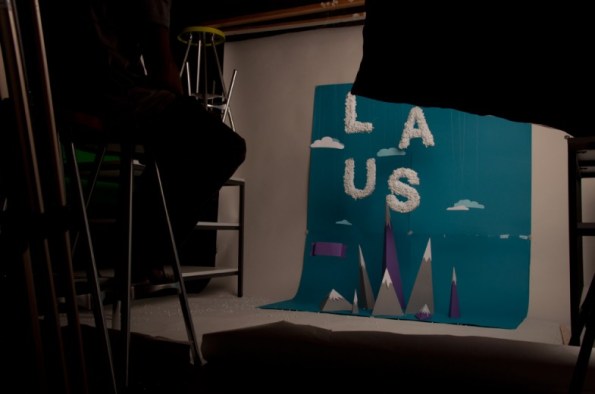
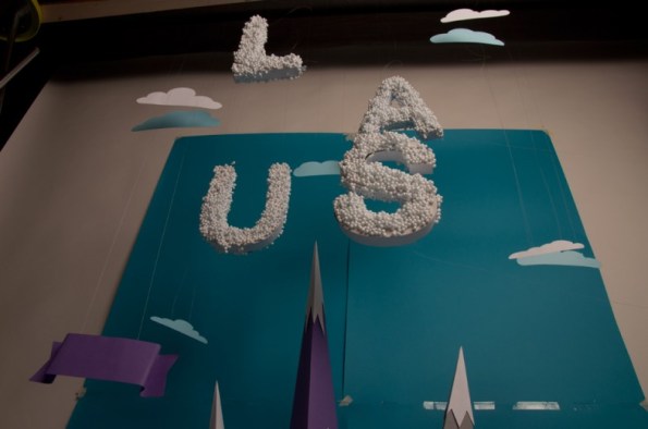
Another mass post of some cool stationery/identity/branding/etc.
———
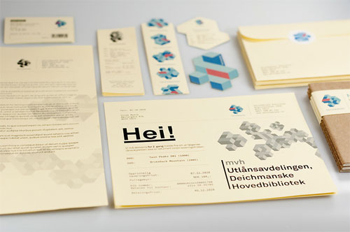
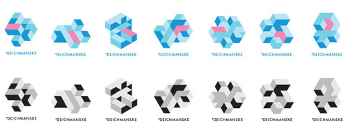
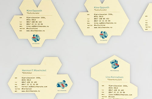
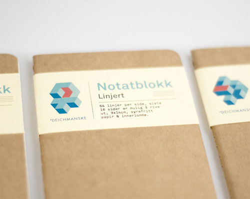
Diechmanske Library. Excellent use of modularity, adaptability, and dynamism in a logo.
———
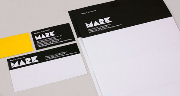
Mark Furniture and Lifestyle of Cornwall. I like seeing some process work. Also the variety of finished materials, that still feel like part of one brand.
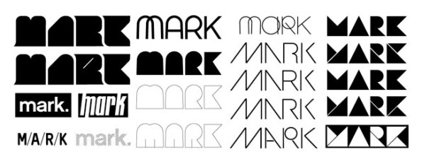

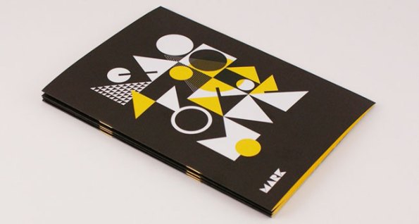
———
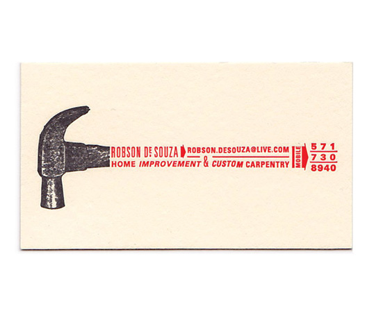
Robson de Souza, designed by Oliver Munday. An appropriate use of hand-tooled design.
———
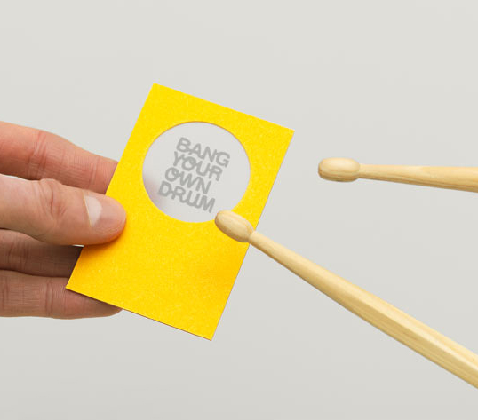
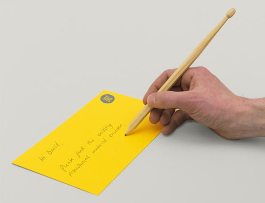
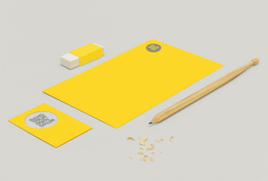
Bang your own drum, designed by The Consult, of the UK. I like the inclusion of the drumstick pencils.
———
Lucky last name allows for a super easy, great logo. Matthew Hole, also of the UK.


———
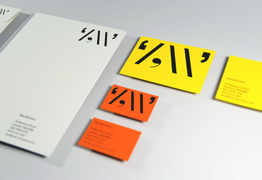
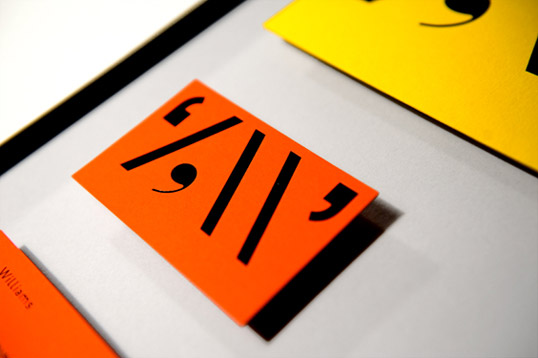
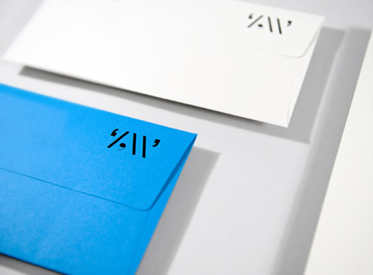
Again with the lucky letters. Excellent nerdy-typographical use of punctuation as letter form suggestion. Well done, Zoe Williams
———
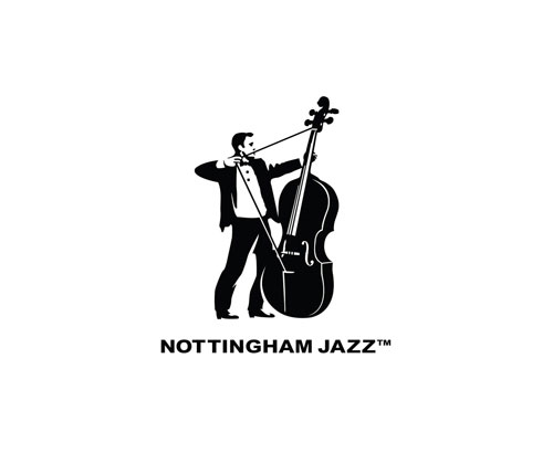
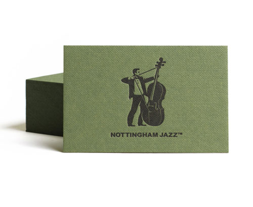
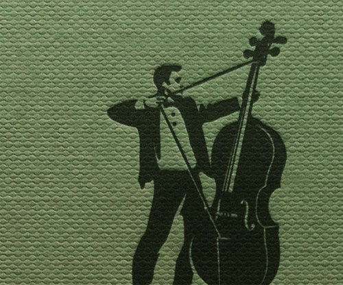
Nottingham Jazz logo, designed by Glad Creative. Love the action in this one.
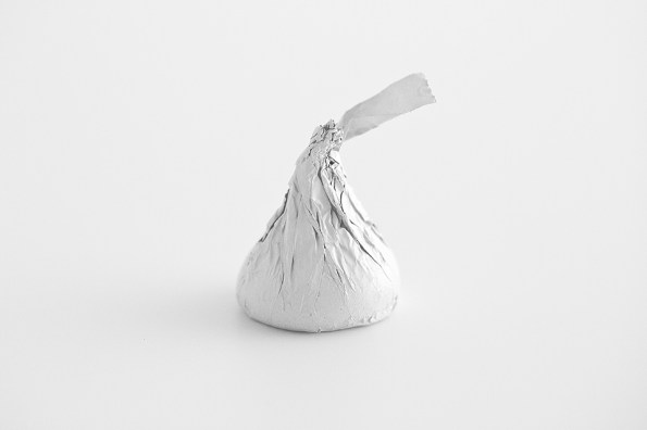
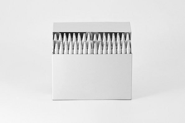
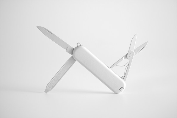
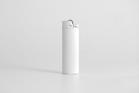
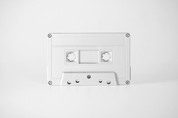
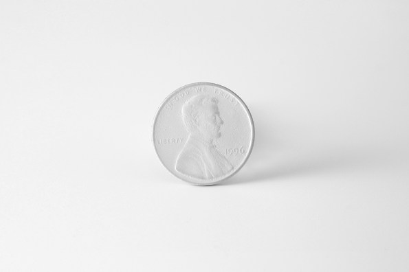
Talk about taking minimalism to the extreme! This project, Brand Spirit, in which ordinary objects are painted white, has some interesting commentary on branding and our capitalist society. Part of the about section reads Brand Spirit: every day for 100 days, I will paint one branded object white, removing all visual branding, reducing the object to its purest form. I really appreciate when a project that looks really good also has a strong concept behind it. Nice job so far, Andrew Miller.
