Prospector Co.
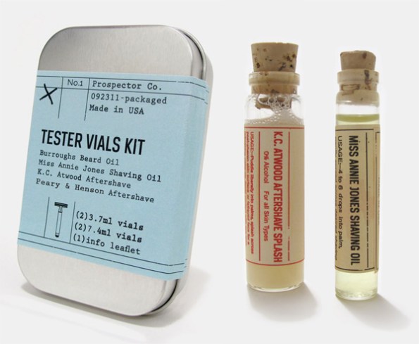
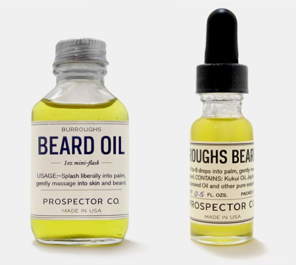
One of my friends in the Graphic Design department, a junior, was complaining about her assignment to design a poster with Type only, and no image or arbitrary shapes. I laughed and reminded her that there is such a thing as Type as Image, or playing with space and scale. This doesn’t exactly do that, but it does prove that something can be beautiful and well designed with just typography and no imagery or unnecessary swooshy whatevers. Prospector Co. makes a series of toiletries for men which perfectly encompass the meeting of modern and traditional, and which present a clean palette without distraction. They aren’t too stark, they still have personality, they feel like something out of the 60s, but they are so clean, they remind you it’s cool to use them now! Though I have no beard to shave (thank god!!), I would buy these anyway, just to display them :)


They almost look more 1860’s than 1960’s! Very pretty.