
This post has been in draft for three weeks because I wanted to make sure I included all the content I’ve been thinking about lately. I’ve been reading a lot about design recently, in addition to looking at it and making it. I wanted to collect a few articles that I thought were worth reading.
I’ve just been given the great honor and opportunity to contribute to Medium. It took me three weeks but I finally sat down to put all my ideas on paper. They still look like this (below) so when I type and publish it, I’ll let you know.

Medium is a place for high quality writing. There are no extraneous details or ads, there are very few images, and the topics are very thought provoking. I’m going to write about design or technology or both. My first article is about keeping a sketchbook. You’ve seen mine before, and you know how important to me it is.
Check here periodically for articles, though I’ll post here too.

These are just a few of the articles that I read recently that made an impact on me. Take some time when you have it to read them. Some of them made some really valid points. I haven’t done much design reading since I graduated, and granted, I didn’t have much time to read at RISD anyway, because the work was so intensive. For some of these, I included quotes that resonate with me, for others, just the links, but that doesn’t make them any less important. The order has nothing to do with hierarchy.
-
When Good Design Isn’t Enough
written by Johnnie Manzari for Medium.
-
Graphic Design Criticism as a Spectator Sport
written by Michael Bierut, of Pentagram, for The Design Observer.
“Everyone wants to stand out, or else what’s the point? But this isn’t true. Most people don’t want to stand out. They want to fit in. More precisely, they want to fit in with the people they like, or want to be like.”
-
Brilliant Words Of Advice From 14 Great Graphic Designers
“I read once about the concepts of a lateral idea and the vertical idea. If you dig a hole and it’s in the wrong place, digging it deeper isn’t going to help. The lateral idea is when you skip over and dig someplace else.”
— Seymour Chwast“One of the things I have observed, looking back historically, is how elegant a seventeenth-century book looks. One of the reasons it looks so elegant is because of the restrictions: there was only one typeface available, there weren’t that many fonts, and virtually all you could do was play with sizes, italics, and so forth.”
— Colin Forbes“My work is play. And I play when I design. I even looked it up in the dictionary, to make sure that I actually do that, and the definition of “play,” number one, was “engaging in a childlike activity or endeavor,” and number two was “gambling.” And I realize I do both when I’m designing.”
— Paula ScherSide note, these quotes are actually a book (part of which is pictured above). The article links to the purchasing site.
-
Lessons in Creativity
by Paul Jarvis for Medium
-
Dieter Rams’ speech
from Vitsœ
Happy reading!
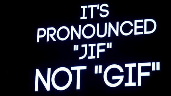
A Short History of the Gif | Moving the Still, by LEGS MEDIA, nicely illustrates the origin of the word GIF, Graphics Interchange Format. My coworkers had quite a debate about the pronunciation. Steven said “I’ve always thought this was interesting, since it’s SPELLED GIF.” and David replied, quite appropriately, “I think its because Jraphic Interchange Format doesn’t quite have the same ring to it.” Benji ended the conversation with “Giraffes love gifs.”
On Mashable, you can read the short history:
Steve Wilhite, father of the Graphics Interchange Format, has ended the heated debate on how to pronounce “GIF.”
Wilhite, then working at CompuServe, debuted the file format in June 1987. He accepted a lifetime achievement award Tuesday at the Webby Awards for his creation.
Instead of giving a vocal acceptance speech, he flashed a GIF on the big screens: “It’s pronounced JIF, not GIF,” read his acceptance speech, which adhered to the ceremony’s five-word speech limit. read more
Follow me on Dribbble to see works in progress. Sometimes I post stuff there while I’m working on it, when I might not post things here until they’re done.
![]()
For example:


Today (May 20) is Dieter Rams’ 81st birthday. Last year Vitsœ re-released the 10 Principles for Good Design poster in commemoration of his life’s work for Braun and Vitsœ. Happy Birthday Dieter, you’ve been an inspiration to me, and countless other designers, for years. Thank you for your contribution to high quality thinking and practice.

This gorgeous poster designed by Jay Fletcher is part of a collection of work he did for the 2012 Charleston Film Festival showing of “Eames: The Architect and the Painter.” I’ve just sent him an email so that I can frame one of these on my own wall, at least until I can own a few Eames pieces myself. I love the idea of an Eames pyramid. Nice work Jay (and Eameses of course)


