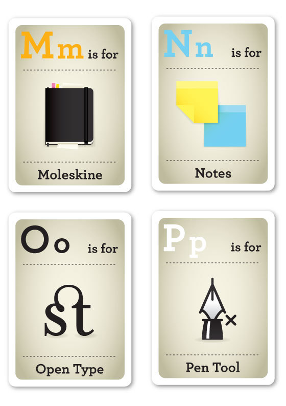
Graphic design nerd flash cards
Okay, not all of these are relevant to me, and I can think of a few substitutions that would have made more sense to the RISD graphic design community, but I still enjoy that K is for blacK (aka key color) and M is for Moleskine.
Things I would have done differently:
B is for bone folder (not bézier curve)
F is for full screen (not Fixie – I’m not a hipster)
I is for eyedropper (not interwebz – no memes for me)
T is for tools (toys what? no.)
V is for mouse (you know, keyboard shortcuts duh!)
X is for X-acto (not alc)
Z is for undo (not z-space)
and, you know me, the back of the cards would not be plaid they’d be minimal :D
(notice how most of my substitutions are adobe keyboard shortcut related)
However, part of what makes designers awesome is being unique, so though I have my own taste for what needs to be on the back of these flash cards, I would in no way make Emma Cook change her project. Nice work Emma, these are very funny. Design Nerd Flash Cards


Leave a comment