Some More Lovely Packaging
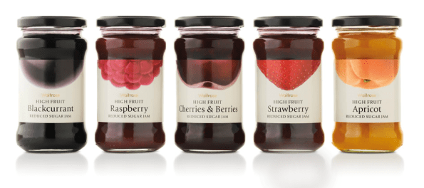
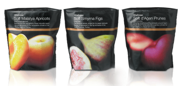
Packaging Part II today (I realize you are reading these in reverse order, so this obvs looks like part one, well there’s another one after/before this, duh): More Pasta! Pinstripe pasta, to be exact. And bread. I love it when people use large luscious images of food on the boxes, in a tasteful way, I’m not talkin’ bout commercials for Red-Lobster/Denny’s sh*t, that’s disgusting. I added a second example below from Turner Duckworth, a San Francisco design firm, and some of their work for Waitrose. Click here to look at more pictures of Gran Farina and read about the designers, Mangion & Lightfoot, from Malta.


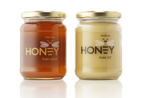
And the Turner Duckworth below (and I threw in the honey even though it doesn’t speak to my point because I love that it is a bee and a honey wand and an E all at the same time, as well as being simple and clean and altogether wonderful):


Leave a comment