I made a new twitter account specifically for Graphic Design so that if you aren’t interested in reading tweets about EDM, you don’t have to anymore. You can still follow my personal twitter, @beccashayne. How is this new twitter different than just following my blog? I don’t always have time to write long, beautiful, detailed posts, so sometimes I share interesting design links straight to twitter. Follow @graphdesSF to keep up!
When Aisle One author, Antonio Carusone, says “Prepare to spend the rest of your day on this site,” he isn’t kidding.
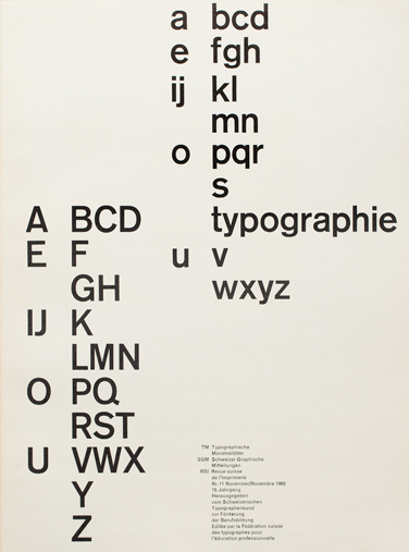
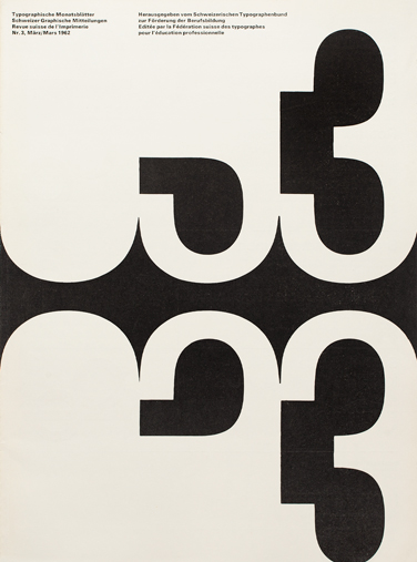
He continues: “TM Research Archive is an incredible website that catalogs cover designs of the influencial journal, Typographische Monatsblätter. The site focuses on the issues from 1960 to 1990, the period that had the most influence on modern typography, and it features interviews with designers that have contributed to the publication over the years, as well information on the designer and typeface used for each issue.” (read more)
Here are just a few examples. I find myself most attracted to the earlier design, but all of these covers are fantastic. Listed below each poster are the designers and typefaces used. The links go to the TM archive and serve as a collection of all other posters using that typeface, or all other posters/covers designed by that designer. Enjoy!
 |
| Cover Design: Robert Büchler Typefaces: Akzidenz Grotesk, Monotype Grotesque |

|
| Cover Design: Emil Ruder Typeface: Univers |

|
| Cover Design: André Gürtler & Bruno Pfäffli Typeface: Univers |

|
| Cover Design: Felix Berman Typeface: Univers |
Remember this summer how I was going to post a long package design post every Sunday? Let’s try that again. Here are three gorgeous examples of package design in the beer industry.
1. Untapped Beer, designed by Kelsey Heinrichs, of Australia.


2. Tin Roof Brewing Co., designed by Unreal, of Louisiana.


3. Loveland Aleworks, designed by Manual of San Francisco. more images


Portal, another Free Download, (though it doesn’t come in outline, it only comes in the liney one and black). Another one from Font Fabric. Though I don’t use them very often, I’ve been particularly attracted to display typefaces lately.

I don’t know why I am so attracted to this photograph, it’s pretty straight-forward. I think it’s just that the subject is very familiar. It’s from this article. The best part is the off-kilter bit, the broken green tip, the asymmetry, the break-the-mold.


