Tired of using the glorious Lorem Ipsum for all your greek text purposes? (PS, most designers know, it’s best to begin the real design only when you have final copy, or you’ll have to redesign a lot of it to make accommodations for the actual text.)
My coworker, Dan, sent me this one, and it’s quite entertaining. And of course the UI is clean and simple. It reminds me a lot of the Artist Statement Generator I posted a while back, except it serves a different purpose.
Riker Ipsum, a sentence generator by Jessica Allen.
Update. I just found out from Dan: “They’re all quotes from commander riker from star trek the next generation.” Apparently I never watched Star Trek so I didn’t know this… That explains the stars in the header text!
Captain, why are we out here chasing comets? Your shields were failing, sir.

Then there’s the Snoop Dogg style greek text generator, which my friend Josh sent me, if you feel like you want a gangsta touch to your space-filler.
Mashable says Billing itself as “the gangsta lorem ipsum generator,” this site is the delight of our developer/design backchannel today. It generates an “-izzle” and “yo mama”-spiked version of standard Lorem Ipsum text, and a different version is generated each time you refresh the page.
I mean, we all know that Lorem Ipsum is the best because it actually generates normal looking text with a variety in length of words and ascenders and descenders and sentence lengths, but, I mean, if you’re bored.
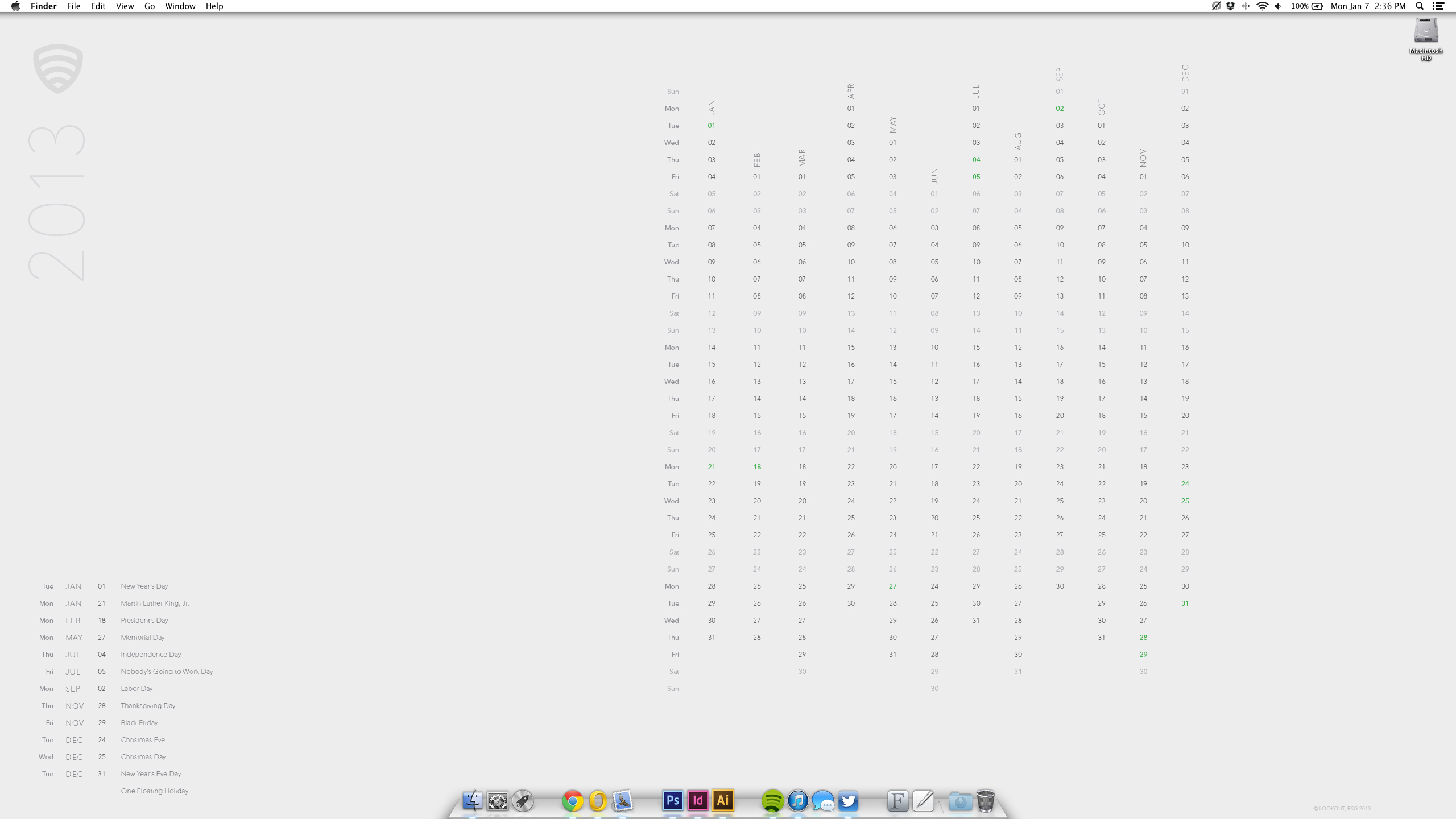
I just finished the desktop background Calendar for 2013 that I designed for Lookout employees. Complete with room for icons (for those non-minimalists who keep files there) It’s optimized for the 27″ Apple display, but I designed other aspect ratios as well.
Typeface: Avenir Next (Linotype)
Designed by Becca Shayne for Lookout © 2013
Modeled here on my gloriously empty desktop (though I do seem to be running all of my programs at once.)
 click to enlarge
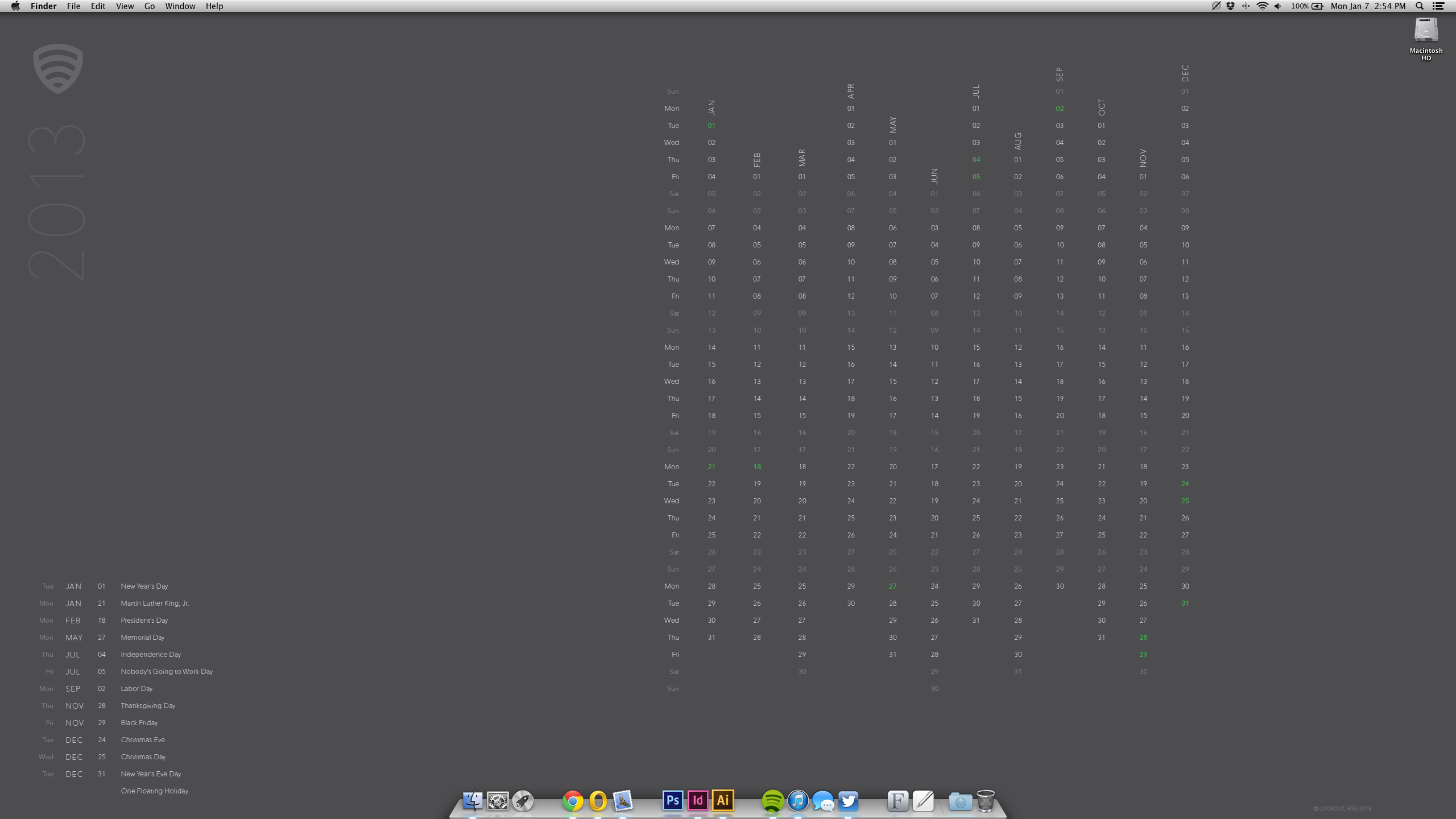 click to enlarge
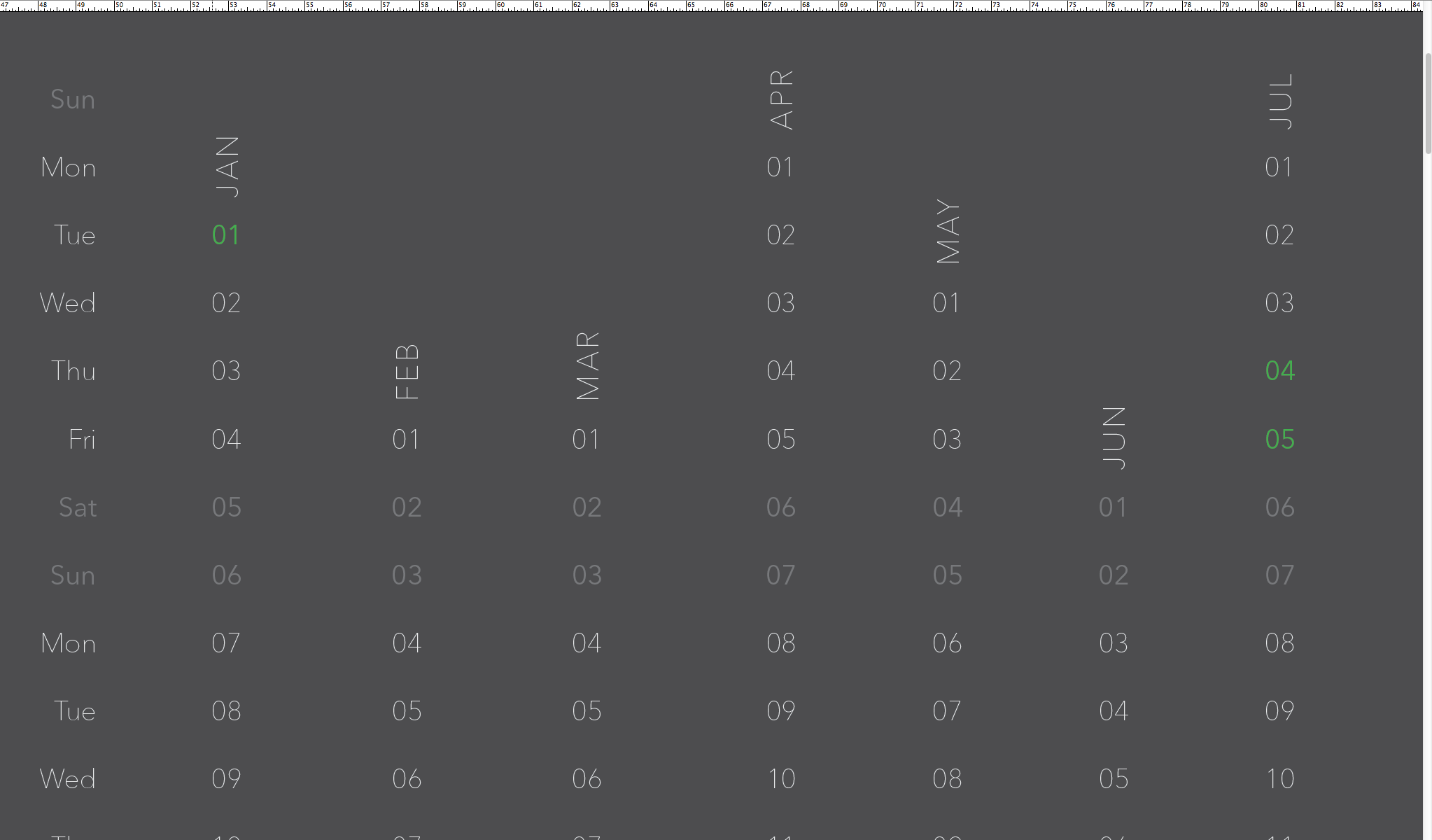 click to enlarge
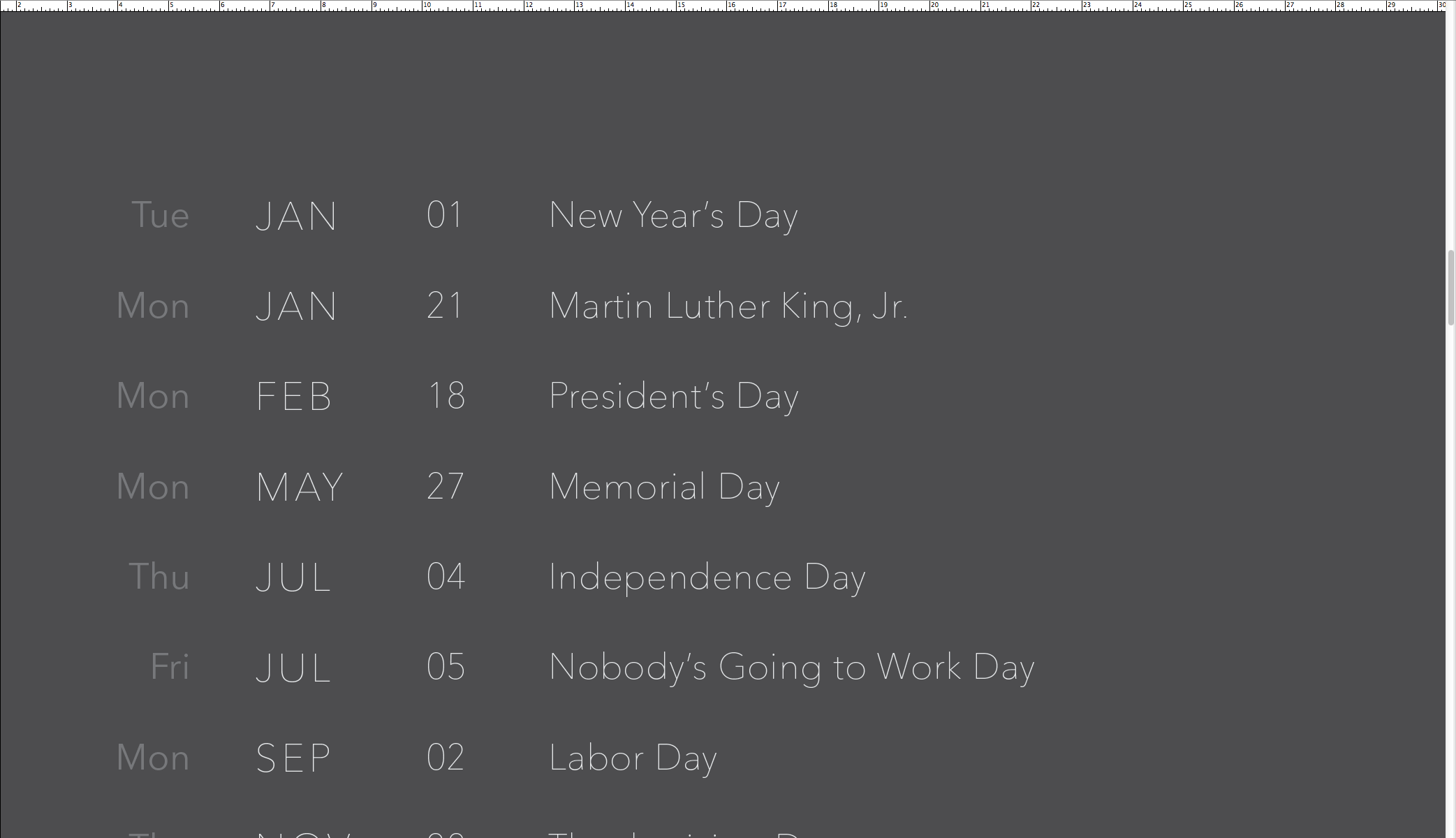 click to enlarge
Thanks Paul for this one.
I like this Dezeen article a lot. It’s a really clever project and it makes a big statement.
British artist Jeremy Hutchison opened a pop-up shop selling useless objects at a London gallery this past December.
The exhibition, called Erratum, will see Paradise Row transformed into a boutique selling objects produced by manufacturers around the world, under instruction from Jeremy Hutchison to insert errors into the designs.
“True luxury has no function,” says the artist. “It is not something to be used or understood. It is a feeling: beyond sense, beyond logic, beyond utility.” (read more)
You can see more images in the original article or on his website.


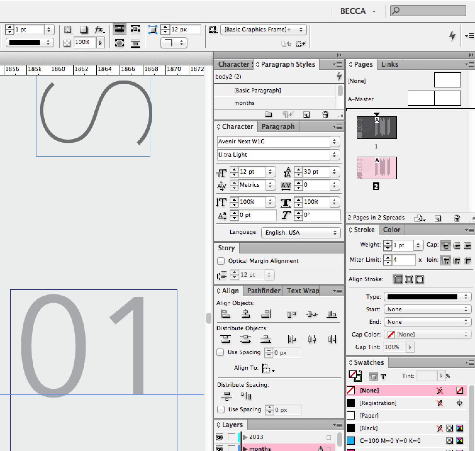
I’m just having a fondness moment for InDesign right now. I mostly use Illustrator at work, but InDesign was, as a RISD grad, my first love. This project is mostly self driven, since it’s internal, and mostly typographical, so I get to revisit my favorite program. Funnily enough, the retina display still just doesn’t look as clean as it does on the 27″ Display, even with Adobe’s update. (If you click the image and zoom in, you’ll see the UI is all grainy and pixellated, which is a bummer). I have my high hopes for future improvements, but right now let’s just bask in the glory of this well organized and complex (in a good way) UI (which is CS6 by the way, but I like the lighter interface better). I’ll post the actual project soon.