Okay, I usually try to post cool design stuff, not stupid funny stuff, but this one just caught my eye :) Also, it’s kind of like a chart, so it reminds me of I Love Charts, but it’s actually from 9gag. Aslo, it’s kinda like thinking outside the box, which is slightly designy. Anyway My favorite one is “The Ikea” :P can’t figure out how to put it together! That’s so real. K more design related posts on the way, promise! (also, I photoshopped their image because it was really dark. Does that make me OCD? maybe just a little…)

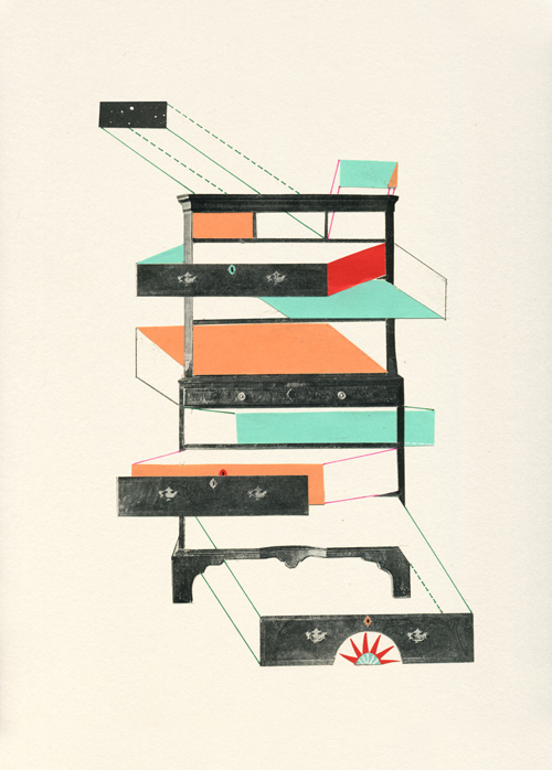
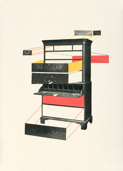
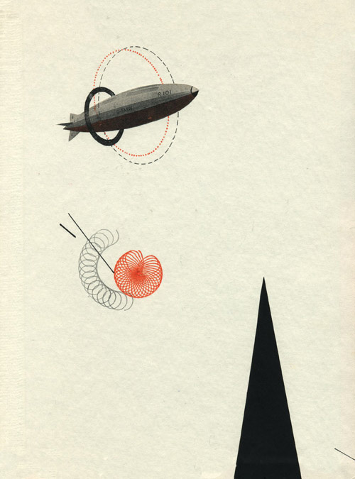
Okay this is pretty awesome. I’m sending you to the original site on Behance to see the rest of Tien-Min Liao‘s project because there’s a lot of detail and a vimeo that you should go see! Here’s a teaser though :)


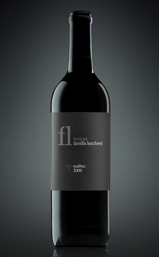
Beautifully subtle and delicious. Love the clever form combinations! I’ve been spending countless hours researching identities/branding etc for my degree project, and I will share some of the great examples soon, but here’s a teaser of the scrumptious designs I’ve been finding. Bodega Familia Lucchesi wine on Markus Work‘s behance, which I discovered while trolling through Design Defined.

Fontfabric Type foundry makes some pretty sweet typefaces, 12 of which are available as a free download. I like Static and RBNo2 best as usable typefaces, but I decided to feature Metropolis because of the awesome posters they accompanied it with :) Go take a look for yourself! you may be interested in the rest of what they have to offer.


Valero Doval, with a BA in Fine Arts from the Polytechnic University in Valencia, Spain, makes some crazy awesome posters out of ink, collage, and “vintage paper.” It’s some really beautiful, unusual work that I’d like to take a few pointers from. He manages to be free and constrained in the same composition.
