These are beautiful. Stunning. Love the shapes, love the flattened versions of the shapes, love how clean the final design is. Not sure how useful pocket calendars are since you can only tell what date is on which day of the week, and that’s the only thing you can use it for, but I still love these. Go see a few more pictures on their site. 2012 Calendar designed by Lo Siento, a studio based in Barcelona. They say on their site, Each of the polyhedrons has different number of faces, corresponding with the number or each month.


So this guy Shawn Hazen, graphic designer who has a studio, Hazen Creative in Chicago, has a massive collection of books whose covers were designed between 1950 and 1980, respectively. He takes awesome huge pictures for us and posts them on his wonderful blog Book Worship, and sorts them into neat little categories based on who designed it, or the content of the cover. Many of them aren’t even design books, just arbitrary topics with famous designers for the covers, or never-heard-of-it designers who still designed awesome covers. Lots of triangles, circles, and overprinting. Go take a look! (I own the Chicago famous buildings one. Really brave minimal cover, considering it’s a photographic guide.)


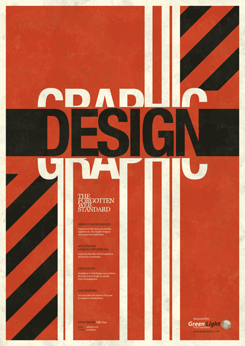
This is Mike Kus‘s poster for “The Future of Web Design in London 2009 called “Graphic Design: The Forgotten Web Standard” and it was given away for free, for which I am totally jealous.” (says the curator of Not.In). I’d have to agree, I am totally jealous that people got this poster for free because it’s gorgeous! It reminds me of these constructivist era posters (probably because of the strong hard lines and the color combo).


