
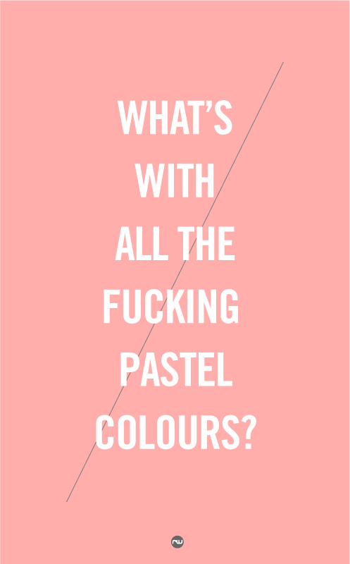
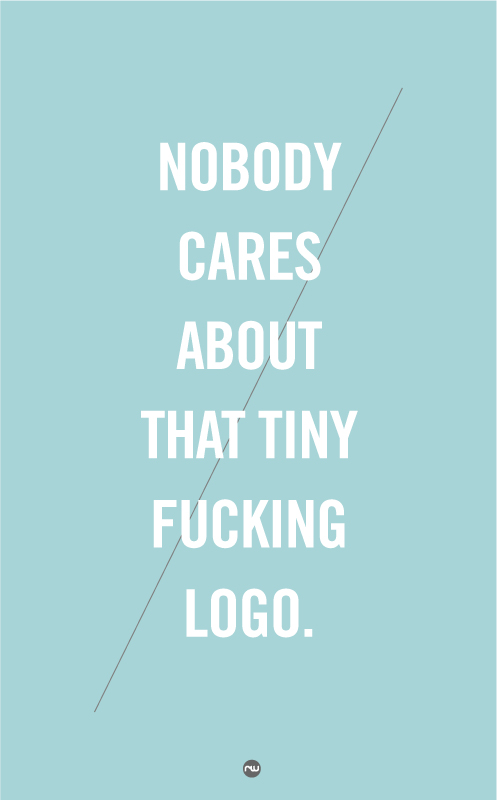
Snarky little poster series by Robert Wilson. Perhaps makes similar commentary on design-trend-uninventive-society that Hipster Branding makes. Everything looks the same if no one creates anything different…

My favorite one from a set of posters from Lab Partners SF‘s archive that they designed for Goodby, Silverstein and Partners as part of their pitch for the JetBlue account.

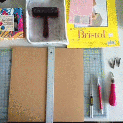
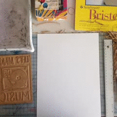
This weekend I decided to actually make something, so I busted out all my block printing tools and made a print. (you can click on the moving gifs and see the prettier, higher resolution versions on Vine).


I’m proud of my latest design-for-social-media for Lookout. A St Patrick’s Day themed Venn Diagram :) (which you can see on the Lookout Facebook Page).

I’m sure you’ve all heard of Nicholas Felton. He’s a RISD 99 GD grad, he’s one of the brains behind Facebook Timeline (he works on the Product Design team now), he designs for all sorts of other things, which you can see here, and he does these awesome Annual Reports about some interesting thing in his life. Basically, he’s an information architecture genius. I’m not sure why I didn’t post these earlier. I was just working on a project with some of the marketing team, and I brought up his work as examples of less-conventional ways to display information. Of course, copying is the highest form of flattery, so now these won’t seem so crazy to you, since everyone is doing similar things. Someone has to be the inventor though, and that is Feltron. You can make your own annual reports with his tool, Daytum. These are some of my favorite spreads from his various reports.


