just doodling.
I accidentally discovered Kasper-Florio studio, of St Gallen, Switzerland last week while browsing Designspiration, and I fell in love. Their use of typography is so reminiscent of what good design was forty-fifty years ago, but it’s not outdated at all. I’m starting to get really tired of stuff like this, which is not good design, but seems to be really trendy. I scrolled through the entire website, and picked a few things to show you.


photograph by Marco Dall’Omo.
If this is real beer, I would learn to acquire a taste for it, even if I didn’t particularly like it, because this is AKZIDENZ GROTESK BEER! Enough said. I love that the heaviness of the beer is described by the weights of the typeface. I’m also a fan of the crisp type treatment in relationship to the bright solid colors. Designed by João Andrade, from Portugal.
He says:
“H. Berthold first published Akzidenz-Grotesk in 1896. The design originates from the type used in Germany by job-setters and trade printers of earlier centuries.
This early sans serif preceded the first weight of Helvetica by over 40 years. Throughout the years, H. Berthold has expanded this extremely popular and versatile family. AG Super, Extra, Super, Italic and Extra Bold was developed in 1968 by Günter Gerhard Lange and is an excellent choice for headlines requiring heavily-weighted strokes.”
Since Germany is the third largest exporter of beer and typography Akzidenz-Grotesk comes from Berlin, I decided to create a beer in honor of one of the greatest and most influential typographies in history.
I played with the different types of weights and widths and with the amount of alcohol in each beer. Each variation of typography represents a different level of alcohol.
As a result we have five types of beers, light, medium, bold, extra and super.
Happy Friday! Enjoy:


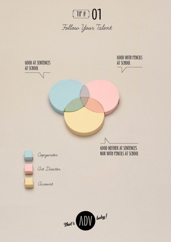
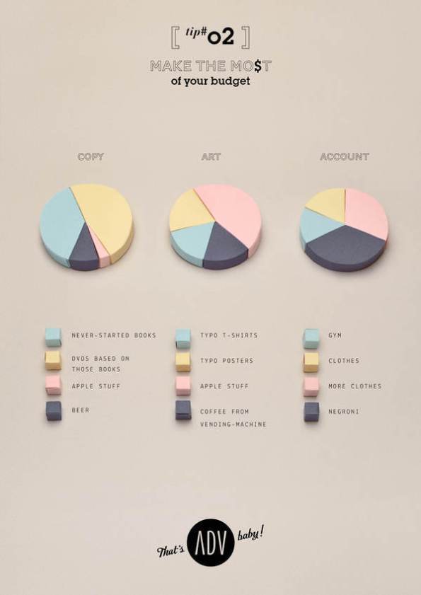
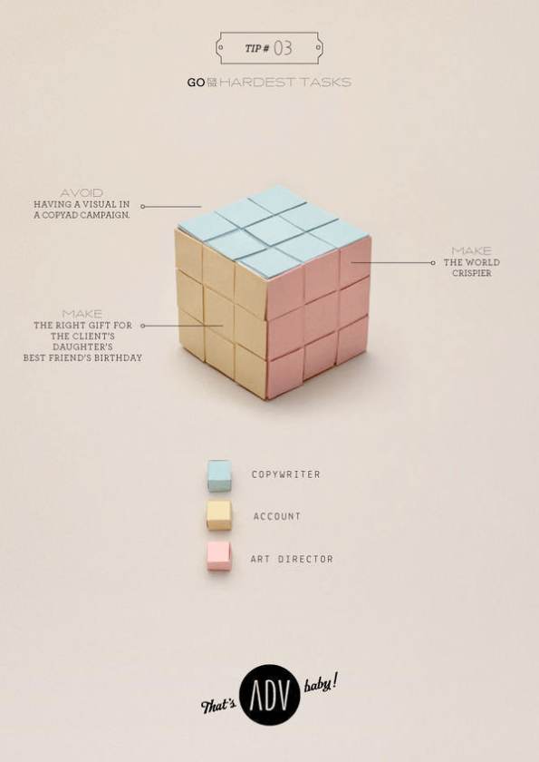
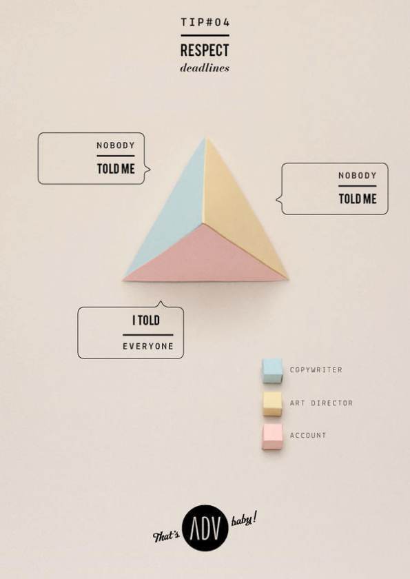
Brilliance. On all levels. The craftsmanship, the typography, the composition, the color palette, the concept, the copy, the execution. Everything. That’s ADV, baby! by:
Fabrizio Tarussio: COPYWRITING
Letizia Bozzolini: ART DIRECTION & PAPERCRAFTING
Photo Cirasa: PHOTOGRAPHY
The post is in Italian, so I can’t tell you anything about what the project was about, but I still think this is an incredibly different approach to information design.